 DEM stands for digital elevation model. A DEM map shows the vertical characteristics of the mapped area. It is a form of remote sensing.
 Friday, August 8, 2008
DEM Map
DEM stands for digital elevation model. A DEM map shows the vertical characteristics of the mapped area. It is a form of remote sensing. Continuously Variable Proportional Circle Map
 A histogram takes data sets and maps them out in a graph form with set ranges between the bars of the graph. This is a fictitous map demonstrating the salary distribution of the Acme company. You can see that the highest number of employees make between 44 and 55 thousand dollars a year.
DOQQ

DOQQ stands for Digital Orthophoto Quarter Quadrangle. A quadrangle is equal to a 7.5 minute square of latitude and longitude. Thus, a DOQQ is one quarter the size of a quadrangle, or 3.75 by 3.75 minutes.
Lorenz Curve
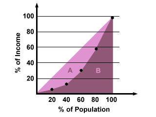 This Lorenz curve shows income distribution across different percentages of the population. Lorenz curves are commonly used to portray income distribution across the population.
Cartographic Animation
 A cartographic animation is a map that has moving aspects which show us what could happen under certain circumstances. In this case, the animation shows what would happen as the water came in from the coast and flooded the coastal area.
DRG
 The term DRG refers to digital raster graphics. Digital raster graphics come from the United States Geological Survey. These graphics are forms of topographical maps.
Isotach Map
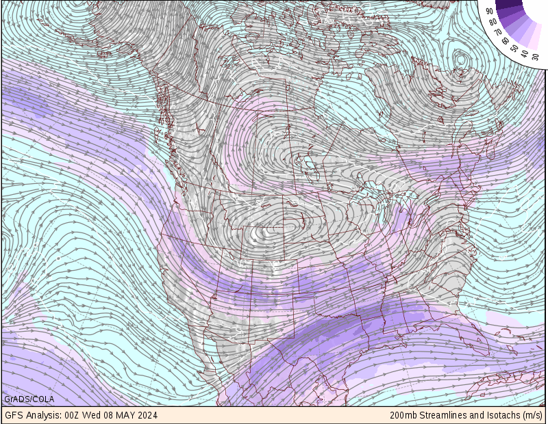
An isotach is a line of equal wind speed portrayed on a map. The wind patterns are displayed over a map of the area the viewer is interested in. This map shows isotach patterns across the continental US.
Isobars
 This map shows isobars around a low pressure system. Isobar maps obviously have to do with the weather in a certain area. Isobars themselves are lines drawn on a map that connect different points that have the same amount of pressure.
Flow Map
 A flow map shows the movement of something from one location to another. They are commonly used to map migration patterns, imported goods, and as in this instance, traffic flows. The roads that are the thickest see the most traffic on a daily basis.
Stem and Leaf Plot
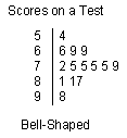 This is a very simple map of a stem and leaf plot. This particular stem and leaf plot maps out grades on a particular test. It is important that there was a bell-shaped curve with regards to the test grades because it shows they were distributed fairly. Teachers often look for this kind of curve when grading work.
LIDAR Image
 LIDAR stands for light detection and ranging. Lidar imaging is a form of remote sensing that maps topographic data. This lidar image is of lower Manhattan in New York City.
Correlation Matrix
 Most correlation matrices have to do with science, such as anatomy, biology, or disease data. Others have to do with stocks market info and financials. This particular correlation matrix maps out T7 proteins. Each horizontal and vertical bar adds up to 1.
Star Plot
 Star Plot analyzing data relating to the 1979 models of select cars. There are usually a bunch of different star plots used to relate information about a set of things.
Planimetric Map
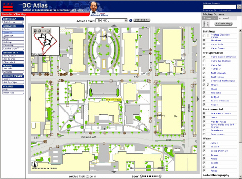 A planimetric map portrays the features of an area with respect to horizontal relation. It does not take into account any vertical features of the area. This planimetric map shows the downtown area of Washington, DC.
Cadastral Map
 This is a Cadastral map of Delaware County, Ohio. A cadasral map shows us the outline and ownership of different sects of land within a given area.
Thematic Map

A thematic map breaks down certain characteristics of an area, such as it's population, religion, or in this case, undeveloped land in Hawaii, and shows us the details on a map of the said area. You can see how all land that is undeveloped in Hawaii is broken down into different categories and mapped by color and design.
Topographic Map

A topographic map shows us the layout of the land from an aerial view, along with mapping out the area's unique terrain using a variety of symbols and lines. This map shows Crater Lake, Oregon, and the surrounding area.
Population Profile
 A population profile shows us the age and number of people within a given population. This data is mapped in abundance through the Census program. This particular population profile shows us the population details for Coventry in the United Kingdom.
Climograph
 A climograph shows pricipitation levels on the same scale that it shows temperature. This particular climograph is from Memphis, Tennessee, which is where I happened to be born. The climograph is broken down by month. You can see which months had the highest temperatures and shich had the most rainfall and compare the two.
Propaganda Map
 This is a propeganda map that shows what Europe would look like if Germany had won World War I. Propaganda maps manipulate data or show things distorted from an aspect that is not reality.
 Dot Distribution Map
 This dot distribution map shows the distribution of the population of the United States according to the 2000 Census. Each dot on map represents 7500 people. Dot distribution maps provide a scale (1 dot:7500 people) and illustrate this information for us so we can see the distribution of the data (population of US). It is interesting to see how many more dots are located on the eastern side of the US.
Doppler Radar Image

This is a doppler radar image of Hurrican Frances taken in 2004. The range on the side and corresponsing colors on the map represent dBZ or the display of echo intensity or reflectivity, which is how doppler radar interprets and measures data. The most intense parts of this hurricane are where the yellow, orange, and red hues are located.
Infrared Aerial Photo
 Above is a high altitude infrared aerial photograph of the Susquehanna Water Gap to the North of Harrisburg, Pennsylvania taken from a NASA aircraft in 1974. This map is significant to me
as my family is from the Harrisburg area and I can identify with the river and roadways portrayed. Red areas usually indicate vegetation and in this case, wheat fields. Clean water will show up as a very dark, almost black tone, as you can see in the river.
Thursday, August 7, 2008
Box Plot
 A box plot is a way of mapping data in an easy to interpret form that allows the viewer to easily compare the variables. This map demonstrates stopping distances for three different kinds of motor vehicles. Design C take the longest distance to stop with A & B being comparable. However, B's median stopping distance is lower than A's.
Statistical Map
 This is a map showing statistical data regarding our upcoming election. The red states represent Republican majority, the blue states Democratic and the off-white Undecided. The numbers within the states represent the number of electoral votes that state is worth. Sttaiscal maps break down data and show us the distribution in an easy to intrepret format.
Cartogram

A cartogram is a thematic map where certain aspects are distorted to demonstrate a the value of something. This is a cartogram of the population of the continental US by county. You can see how distored the map has gotten; it is barely recognizable aside from the inlaid guidelines. If you look specifically at the counties in Florida, a state we know well, you can see which couties have the highest population concentration.
Scatterplot

This type of map is known as a scatterplot. This particular scatterplot shows the correlation between ages of husbands and wives. There is a fairly consistant relationship between the two. There is a very strong relationship in the early years and as the subjects get older the plot gets a little more scattered showing greater difference in age.
Windrose
 This image is that of a Windrose. A windrose depicts directionality of the wint alont with the speed of the wind in knots. This particular windrose is for Olympia, Washington. As you can see, the wind is blowing in a primarily southerly to south-westerly direction.
Mental Map
 This image is known as a mental map. The author knew the layout of the area, and then proceeded to map out the neighborhood by memory. The map is obviously not accurately drawn to scale. Notice the childlike descriptions and details given for certian aspects.
Black and White Aerial Photo
Friday, June 27, 2008
Week 7 Assignment - KML File
The following is an image of Sichuan, China following the May 12th earthquake that had a magnitude of 7.9 on the Richter Scale. The type of remote sensing data we are viewing is an arial photo with photographic film that has a black and white emulsion. The website where I aquired this image which I then downloaded as a KML file is: http://google-latlong.blogspot.com/2008/05/imagery-for-sichuan-china-earthquake.html.


Subscribe to:
Posts (Atom)